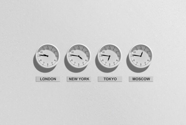
Contrast: How to Use It to Your Advantage?
Contrast is the first lady of design. It is important because it gets your attention, drawing your eye to the screen or to the element on which you are focusing. It causes you to pay attention, to notice something or to focus in on it. Contrast can be created in many different ways: you can use size, texture, color, shape, emphasis, placement, style and a whole host of other differences between objects to create contrast.
Here is the key. Imagine an image of a girl holding an apple in one hand and six donuts in another.
Would this image have the same impact if the girl were holding only one donut? Hardly. The contrast between the apple and the six donuts emphasizes and makes clear the difference. From a cognitive perspective this is very important because otherwise you just confuse the brain. Since the brain will not recognize smaller differences as readily, using two fonts that are almost alike but just slightly different will lead to confusion. The same is true for two fonts close to the same size but not exactly the same or two colors that are so close that the brain cannot easily interpret the difference.
Text-rich screens and publications tend to be low-impact and very grey. High-impact designs have light and dark, big and small, bright and neutral areas. Contrast takes advantage of white space. Contrasting sizes can create visual tension and help to keep the learner engaged. Too much contrast though, can be overwhelming. The secret to using contrast effectively is to balance contrast with consistency. Your design must be dynamic enough to keep the learner engaged and consistent enough that your content emerges with strong character.
Contrast adds visual interest to your presentation or publication. Contrast is what makes you look back at a screen or makes you keep on looking. In a face-to-face environment your options may include tuning out the presentation, but you are more or less a captive audience. In the world of e-learning, your learners can disengage and leave the computer at any time. In fact, the average web page turner stays on any page for less than five seconds. The most important thing to remember about contrast, then, is, if it is different, make it VERY different.
Repetition: Again, and Again and Again!
The second element of good design is repetition. We know through a host of research studies that repetition is one way to enhance the probability of learning taking place. Why? Repetition increases the chances of getting the content into the short-term memory. We call it a lot of different things in training and learning circles. The important thing is that, as designers of learning materials, we must use repetition. We have to practice what we preach. Too often we expect people to take in and remember content they have seen only once. They usually see it for a few fleeting seconds on a screen and never see it again, until, of course—the test!
Repetition sets the stage; it reinforces ideas and gives
the learner another chance to get it. It offers a feeling of consistency, safety and stability. Repetition provides cognitive reinforcement in the mind of the learner. When you use repetition for learning, you should use it to tie things together and make the presentation look like it is all part of the whole.
A lot of fuss has been made about branding e-learning, and repetition of a logo, color schemes and icons are certainly a way to accomplish that. By incorporating unifying identifiers like logos, fonts, layouts and colors, you take away the necessity for the brain to think about these things. Always remember, you do not want your learners to be thinking about the design of the material. You just want them to feel comfortable and good about it. Branding on screens or e-learning is often an example of repetition, something that ties it all together, thus creating a feeling of unification or association.
What you want to avoid with repetition is boredom, so you need to be creative in ways that allow for repetition but still provide enough contrast and interest to engage the learner’s attention. Repetition doesn’t have to be boring!