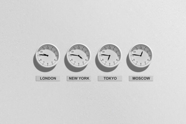
Repetition: Again, and Again and Again!
The second element of good design is repetition. We know through a host of research studies that repetition is one way to enhance the probability of learning taking place. Why? Repetition increases the chances of getting the content into the short-term memory. We call it a lot of different things in training and learning circles. The important thing is that, as designers of learning materials, we must use repetition. We have to practice what we preach. Too often we expect people to take in and remember content they have seen only once. They usually see it for a few fleeting seconds on a screen and never see it again, until, of course—the test!
Repetition sets the stage; it reinforces ideas and gives
the learner another chance to get it. It offers a feeling of consistency, safety and stability. Repetition provides cognitive reinforcement in the mind of the learner. When you use repetition for learning, you should use it to tie things together and make the presentation look like it is all part of the whole.
A lot of fuss has been made about branding e-learning, and repetition of a logo, color schemes and icons are certainly a way to accomplish that. By incorporating unifying identifiers like logos, fonts, layouts and colors, you take away the necessity for the brain to think about these things. Always remember, you do not want your learners to be thinking about the design of the material. You just want them to feel comfortable and good about it. Branding on screens or e-learning is often an example of repetition, something that ties it all together, thus creating a feeling of unification or association.
What you want to avoid with repetition is boredom, so you need to be creative in ways that allow for repetition but still provide enough contrast and interest to engage the learner’s attention. Repetition doesn’t have to be boring!


